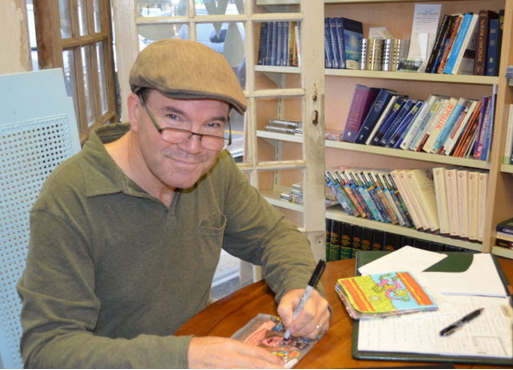
From 1982-1994 I worked on getting my Master of Fine Art degree from San Jose State University in California. I took a number of high level art theory and criticism seminars where studied intensely studied the recently past and current styles in the art world. Foremost among those at the time was Neo-Expressionism. There were many compelling artists working in this style that I liked, including David Salle, Robert Longo, and Eric Fischl. In addition we studied other strains, including the Pattern and Decoration movement, which I liked quite a bit.
One artist I discovered at the time stood out to me. He stood out because he was was not part of these or other contemporary movements. He was completely unique; sophisticated, astute in his subtle social and political messaging and unabashedly contrarian in his relationship with current art. His name is Neil Jenney and he is the next artist in my ‘Artists I Love’ series. Links to the other artists in the series can be found in the menu above and in a list at the end of this post.
Window #6, oil on panel with painted wood frame, 1971-1976
What you see here is one of the signature paintings of his career. It’s a detailed oil painting of a landscape, but not one where you can see much. It’s as much about what you can’t see as what you can. It’s seems to be a window high up in a room, you are looking out, but what really is out there? You can’t see much, just the tree and the sky. But you can also see something that doesn’t seem to fit. A cloud that almost looks like a marshmallow. It’s way too perfectly formed to be a real cloud so what is it? Good question. Too bad you can’t see more, right? Or wait, maybe not seeing more is what makes you think more intensely about what isn’t there. Maybe your imagination is engaged. Maybe it’s great art because of that. I think it is.
But let’s go back a bit to get a little better glimpse of the ideas behind his work.
BAD PAINTING
What you see below is a bad painting. It’s bad on purpose to make a statement. Back in the late 60s a new genre came into being called ‘Photorealism’. Artists took a photograph of a scene and painted it to an extreme level of accuracy. They actually enhanced the scene often to be even MORE realistic than the photo. Neil Jenney hated this trend. He understood the technique took some skill but for what purpose? To just recreate a photograph? He saw it as soulless and trite. He said to a friend that instead of having a bad idea and doing it well, “it would be better to have a good idea and do it terrible!” Which is exactly what he did. He called it good drawing, bad painting.
Saw and Sawed, acrylic on canvas with painted wood frame, 1969
Here is an example of the art Jenney was seeing when he decided to go in the opposite direction.
Robert Bechtle, Alameda Gran Torino, 1974, oil on canvas
He continued in this vein for a few years and was rewarded with his work being designated as ‘bad painting’, not as a derogatory critique, but as a positive statement about a new sort of realism.
Birds and Jets, Acrylic on canvas with painted wood frame, 1969
Threat and Sanctuary, acrylic on canvas with painted wood frame, 1969
Girl and Doll, Man and Mirage
What do all these have in common besides the ‘bad painting’ technique? They are all about a relationship between two things. The purposeful lack of details in both the paintings and the titles were Jenney’s ingenious way of being a social and political artist without being pedantic or propogandistic. His message is a starting point of an idea, a hint towards a concept that the viewers have to figure out for themselves. It’s one of my favorite attributes of great art and he does it immaculately in these paintings.
GOOD PAINTING
The good paintings were a result of two things. One, the limits of doing ‘good drawing, bad painting’, and two, the plethora of artists who had started to do similar work. Jenney is a contrarian and really dislikes doing what the crowd does. The combination of those two things caused him to decided to do ‘good drawing, good painting’. He started doing very detailed and highly accurate realistic paintings. But, as in the bad paintings, he does not spell things out. He just gives clues. The good paintings are as much about what is not seen beyond the frame as it is what is in the frame.
It also is about the relationship between words and images, as are the ‘bad paintings’. It’s another element that resonated with me, as you can tell by how prevalent words are in much of my work.
Meltdown Morning, 1975, oil on board with painted wood frame
It’s not the best reproduction but in the distance on the right you can see the hint of yellow. That could be a sunrise but it could be a nuclear accident. There is power in the ambiguity and simplicity, as well as in the contrast between nature and man.
North America Acidified, oil on panel with painted wood frame, 2013
A beautiful scene of nature, but the ominous title says something else might be going on.
Atmospheric Formation – Rabbits, oil on panel with painted wood frame, 2005
Sometimes it’s just light hearted play Jenney indulges in.
Morning, Evening, oil on panel with painted wood frame, 2012
I love these images because they just say so much about perception and how minimal it can be and one can still know exactly where you are and what time of day it is.
Ozarkia, oil on panel with painted wood frame, 2012
North American Aquatica, Oil on Panel with painted wood frame, 2006-07
Modern Era, Oil on panel with painted wood frame, 2006
I think this is a very sophisticated critique of modern art. Not pedantic or overly weighed down with opinion, but in it’s simplicity one can see the disdain.
Improved Picassos
Here’s an idea for a sure fire way to be criticized: Decide you can improve upon the paintings of the perhaps the greatest artist of the 20th century. Jenney decided to do just that. He happened to see someone in the Port Authority terminal in NYC selling painted reproductions of Picasso paintings. He bought one from him and decided to improve it, fixing what he saw as incomplete or bad passages in the art. Then he framed them how he would like to see them, instead of the way he saw them framed in the famous museums of the world.
It’s a cheeky and pretentious effort to do something like this, but Jenney didn’t care about what others would think. He wanted to ‘fix’ them so he did. Other people didn’t like it? Too bad for them. I have to admit I really love that ‘in your face’ attitude he has. It’s liberating for artists to see this and realize decisions about our creativity are ours to make, not someone else’s.
He eventually commissioned the artist who did the original copies, Ki-Young Sung, to paint specific Picasso pieces he had always wanted to rework.
Improved Picasso – Boy and Horse, original on left
Improved Picasso – Marie Therese Leaning, original on right
Improved Picasso – Igor Stravinsky
Improved Picasso – Bathers
Improved Picasso – Woman
Conclusion
Neil Jenney is my favorite type of artist, maybe because I feel a kinship with his outsider status. Outsider doesn’t mean uneducated, unsophisticated, or untalented. It simply means the artist does not fit in, either on purpose or by virtue of place, time and style, with the prevailing trends of art at the time. He or she can still be quite popular among collectors and other art people, but it’s a popularity based more on genuine admiration for the work than on any commercial or social advantage one might get by having a piece by the artist.
When I graduated from UC Santa Barbara in 1978 I moved to the San Francisco Bay Area. Within 3 months of my arrival the Mayor of San Francisco, George Moscone, and City Supervisor Harvey Milk were assassinated by former Supervisor Dan White.
Three years later a bust honoring Mayor Moscone, created by the artist I am highlighting today, was unveiled. Here it is.
The artist is Robert Arneson. Take a close look at the detail picture. Can you see the ‘Twinkie’ and the ‘bang, bang, bang, bang,; on the pedestal? Those referred directly to the assassination, along with the imprint of a gun on the backside. As a result, the bust was rejected by the City Council and not put in City Hall as expected. The other result was Robert Arneson and his art became known throughout California and the nation.
I was at the start of graduate school at San Jose State University and learning about the fantastic artists that practiced in Northern California. There are already two of them in this series, Wayne Thiebaud and Richard Diebenkorn. And another was Robert Arneson.
Robert Arneson, 1930 – 1992
Arneson was a co-founder of the california ‘Funk Art’ movement of the 60s and 70s. He was not a painter but a sculptor using ceramics combined with non-traditional objects. He was breaking the mold of what ceramics should be by moving away from functionality and creating political, social, artistic and personal statements driven by his personality, aesthetics and beliefs.
Self
I thought about not putting a photograph of him in the article because, well, here… take a look at who his subject matter most often is.
Kiln Man‘Pic’, 1980, Lithograph. Photo courtesy of Rob Corder‘Brick Bang, 1976‘Head Lamp’, bronze with wood and bulb, 1992
Humor as Social Commentary
Obviously you can see he is very funny and works that humor into his art. But it’s more than just silly humor. It’s using humor as satire, and farce to make a statement about the social and moral issues of his time. He is in that long tradition in art that reaches all the way back to Honore Daumier in France, through to William Hogarth in Britain and on to Thomas Nast in America to name a few. Satirical art that pushed the powers that be by lampooning them has continued into the present day of course, with it’s most tragic manifestation being in the murders of the staff of Charlie Hebdo by Islamic terrorists in France in January, 2015.
It takes courage to make fun of people for a reason, and Arneson didn’t shy away from it. But, as with the great satirical artists before him, he often wasn’t pointing so much at a particular person as he was using that person as an example of a larger corruption, a more widespread idiocy in society or morals.
Colonel Hyena, ceramic on metal base, 1985Hiroshima UrnNuclear Warhead, 1984
Upending the Classical
He also liked upending the aesthetics of the classical. To do this he literally just did it. He took something classical, a column. And upended it by adding a head on top, on bottom, falling off, etc. Of course the head in all these cases was his own.
Pedestals, 1992, Bronze, UC San FranciscoBig Laughs, CeramicTemple of Fatal Laffs – detail
Egg Heads
Towards the end of his life Arneson started doing a series that seemed more melancholy and universal, the ‘egg head’ series. They are more of a meditation on life and death than anything else, and it makes sense that they would be as Arneson was by this time diagnosed with cancer and was struggling with these monumental issues.
WorthSee No Evil, Hear No Evil (Egghead series), 1989, UC Davis
And More
As with any prolific artist there are a lot more pieces you won’t ever see than that you will see. Here are some others I thought worthy of your attention.
Wolf Head (Jackson Pollack), 1989, Bronze and RedwoodSinking Brick, 1966, terracottaGolden Rod, 1969, Luster Glazed CeramicBenicia Bench, 1991, Bronze
Courage of the Artist
What I appreciated about Arneson more than anything else was his determination from early on to be truly himself. What I mean is he withstood pressure to be a classic ceramic artist, to be serious, to be socially active the way others had been before him. But those things weren’t him and he knew it. He stated in his life and in his work, ‘This is who I am and what I do. These are my creations done as I see fit.’ Which is, after all, the essential job description of an artist.
Writing by Marty Coleman
Artwork by Robert Arneson
Some artwork photographed by Rob Corder.
You can see more ‘artists I love’ using the drop down menu at the top of the page.
People tend to put professional photography into a very serious box. It’s used to show the worst of humanity and nature, a very serious thing. It is also used to show the highlights of both, which ironically is usually just as serious. It is true that in recent years, with the advent of the cell phone camera and the internet, everyday snapshots of very funny events and juxtapositions have proliferated. But in professional photography, seriousness still is given the top shelf on which to reside. It’s not that different than in cinema. Funny movies and comedic actors just don’t get the same level of respect and reward as do those that are serious.
But, in spite of that, we still have great comedic movies and actors. We also have some very funny photographers. Foremost among them in my mind is Elliot Erwitt. He is one of my all time favorite photographers. He spent 50+ years as one of the preeminent photographers photographing the world. He was a founding member of Magnum, the elite photography agency started by Robert Capa mid-twentieth century. He eventually became its president. He took some of the most iconic and important political and social photographs of that century. He was a VERY serious photographer. At the same time he was the least serious photographer you will ever find.
The perspective of Erwitt is not to be purposely funny. It’s to record a world that has interesting juxtapositions that can sometimes be very funny. They can also be poignant and stark in their irony and pathos as they reveal the human condition.
Dogs and other animals
No one has ever been better at capturing the humanity of the Dog and other animals.
I have been drawing and photographing the nude figure since I was 17 years old in High School. As I matured, one of my goals in doing the nude has been to juxtapose the inherent sensuality of the nude with something that offsets it. It can be humor, a unique visual perspective or something disturbing. I want there to be an element that draws people away from the sensuality just enough to make them stop and think about it. I was inspired in that direction in no small part due to Erwitt and other photographers ability to do that so successfully.
I have focused only on what I think are his humorous pieces. He took photos of some of the worlds most important leaders and entertainers as well as some of the iconic national moments in America. If you like what you see here, do an information or image search of Elliot Erwitt. There are fantastic collections of his work out there as well as revealing articles and histories of his place in 20th century photography. He’s well worth exploring further.
_________________________
You can see and read the entire ‘Artists I love’ series here or by going through the list below.
In spite of their popularity during my lifetime, I’ve never been a huge fan of many of the Impressionists. But there are a few that I have loved from the first time I saw their work; Degas, Manet, Caillebotte.Ranking in that top group is the only American and only one of two women (the other being Berthe Morisot) to break into the ranks of first generation Impressionists, Mary Cassatt. She is an artist I love.
Mary Cassatt
Today, she is best known for her domestic scenes of mother and child such as the two below.
Maternity, 1890
At the Window, 1889, Pastel on Paper
But, as is typical of most artists, what she was most famous for was not her style at the beginning of her career. She first painted images using a low intensity palette of color, with grays and browns predominating, as was the fashion in the Paris Salon. The subject matter was somewhat theatrical and staged, removed from elements of everyday life, much like a studio portrait photograph is now.
Toreador, 1873
Spanish Dancer Wearing Lace Mantilla, 1873, Oil on Canvas
Portrait of a Woman, 1872, Oil on Canvas
As refined and polished as these paintings are, you can see in the unfinished double portrait below that she had a very exciting and vibrant brush stroke underlying her work.
Sketch of Mrs. Curry and Sketch of Mr. Cassatt (upside down), 1871
Transformation
Between the early 1870s, when these paintings were created and exhibited at the official Salon in Paris and the late 1870s, Cassatt had an artistic transformation.The catalyst for this transformation was her interaction with a fellow artist, Edgar Degas.
Edgar Degas, 1865
Degas, 10 years older than Cassatt, first saw her work at her studio in 1877 and immediately invited her to be part of the ‘independents’ exhibition of artists known as ‘Impressionists’ (a name neither of them ever liked). However, before they had ever met, Cassatt had been enthralled by a number of pastel drawings of Degas she had seen in a storefront window. It was this first brush with his style that freed her to pursue a new direction in her own.
Mary by Edgar
Degas painted Cassatt at least 8 times. He used this one drawing of Cassatt as a basis for at least 3 other paintings and drawings.
‘Mary Cassatt at the Louvre’, by Edgar Degas, 1879, Pastel
Here’s one of them.
‘Mary Cassatt at the Louvre’, by Edgar Degas, 1885, Pastel and Etching
At the Opera
One of Cassatt’s most well known works is this one. Interesting to note the social commentary she’s added to the painting with the older gentleman in the background looking at the woman as she looks at the stage.
In the Loge, 1879, oil on canvas
She also depicted herself at the theater.
Self Portrait at the Theater, 1879, Oil on Canvas
This one is not designated a self-portrait as far as I can tell, but the face does look very similar to Cassatt so I think it’s a good bet it is of her.
Woman with a Pearl Necklace in a Loge, 1879, Oil on Canvas
The one below is not a self-portrait but is of interest because of her experimentation with metallic paint amidst the more traditional material.
At The Theater, 1878, Pastel and Gouache
The Experimentalist
Cassatt was a rigorous experimentalist with her art. She not only embraced a then radical painting style, but she also investigated many areas outside her realm of expertise. She often used the same image (as do many artists), transforming it by using different media.First is a quick sketch of a scene at the Opera. This could very likely have been done at the actual opera house.
The Loge, 1878, graphite on paper
She then returned to her studio and created an oil painting of the scene.
The Loge, 1878, Oil on Canvas
She then created two entirely new pieces using the printmaking techniques of Etching and Aquatint.
The Loge, 1878, Etching and Aquatint
The Loge, 1878, Etching and Aquatint
The Japanese
In 1890 an exhibition of Japanese prints came to Paris. When Cassatt saw the show she was immediately taken by the graceful simplicity of line and color.She started in on a series of prints influenced by this style. She embraced this style and recreated it with a modern French sensibility.
The Child’s Bath, 1893, Etching and Aquatint
Once again, you can see her experimenting. In this case she uses the same Intaglio plate, to print different versions of the same image.
The Child’s Bath, 1893, Etching and Aquatint
Under the Horse Chestnut Tree, 1898, Etching and Aquatint
Woman Bathing, 1890, Drypoint and Aquatint
The Fitting, 1891, Etching and Aquatint
The Coiffure, 1891, Etching and Aquatint
Later work
Mary Cassatt became a very famous and respected artist and collector of art. She was award the Legion d’honneur by France in 1904 for her contribution to the arts.She continued to paint well into the 20th century. Her style by that time was set and she did little further experimentation. Her subject matter from 1900 on was almost exclusively domestic scenes of mothers and children.
Young Mother Sewing, 1900
Reine Lefebre and Margot Before a Window, 1902, Oil on Canvas
She even had 2 prints in the famous 1913 Armory show in New York City. However, by 1914 she was blind and ceased to paint. She died in 1926. Ironically, her reputation in the US was not nearly as grand as it was in France. She was overshadowed by her brother, a railroad magnate, and had an unfortunate split with her sister-in-law over women’s suffrage. As a result her family boycotted an exhibition of her work in Philadelphia. This led her to donate her vast collection of her paintings still in her possession to museums and not her heirs.
There is a museum here in Tulsa, a gem relatively unknown outside of Oklahoma and the art world. Philbrook Museum of Art was originally an Italian inspired mansion built in 1927 by Waite Phillips of Phillips 66 lineage. He and his wife gave the estate to Tulsa in 1938 as an art center and it’s been Tulsa’s center of art appreciation and education ever since.
Philbrook Museum of Art and Gardens
Alexander Archipenko is also a gem relatively unknown outside the art world. If you know Cubist and Modernist art history, specifically sculpture, you may have heard of him. Otherwise it’s not likely.
Alexander Archipenko, 1887-1964
Giddy Rediscovery
Even though I am an artist and studied art history, I know of Archipenko for a more personal reason. My grandparents had a great collection of art in their house growing up. Most were mid-twentieth century American drawings and prints. But they had one art piece that was different than all the rest. It was a small figurative sculpture by Alexander Archipenko.
I had largely forgotten about this sculpture when In 2012 I was leading a group of photographers on a photo shoot called ‘Black and White at Philbrook’. I turned into one of the 72 rooms of the mansion/museum and found this in front of me.
Standing Concave, Bronze – Philbrook Museum of Art
I knew immediately it was the sculpture. I knew it wasn’t THE sculpture because the one my grandparents had was silver plated bronze and this was just bronze. But it was the same sculpture made from the same mold. Most bronze sculptures are made in multiples.
I actually got giddy about this unexpected find. I remember telling some of the people with me about it being the same one I had been around as a kid. I wasn’t at all sure they believed me, but I was excited nonetheless. It brought me back to my youth, to my grandparent’s house and to my unadulterated love of art.
Here is another view of the piece I took in color so I could send it to my family to double check my memory. My older sister at first wasn’t sure it was the right one but eventually came to the conclusion it was.
Standing Concave – Philbrook Museum of Art
Standing Concave / Glorification of Beauty, 1914
Touching and Being Touched By
This is the piece. It looks silver but it is actually a bronze sculpture that has been silver plated. All the grandkids loved to touch it’s cool surfaces and trace the lines (maybe the boys a bit more than the girls). I may have been a giggly little boy thinking it was fun to touch a naked sculpture at some point but what I ended with was a love of the form, style and surface. I am sure Mama Powell wasn’t happy about all the fingerprints but I don’t remember it being a big deal. This piece, and the others in their home, really were the visual starting point for me wanting to be an artist from an early age.
I found out in my research that it actually has two names. It’s listed most often as ‘Glorification of Beauty’ but I remember the word concave always being associated with it and it is also named ‘Standing Concave’ The Philbrook piece is named that way for example. Funny how that goes, I know in my own work I might look at an image years later, not remember the title and retitle it something completely different so it would make sense that it could have two names.
___________________
Alexander Archipenko (1887-1964)
Archipenko was originally from Kiev in Russia (now part of Ukraine). He moved to Paris in 1908, becoming a creative contemporary of Picasso, Malevich, Duchamp, Derain and others. He moved quickly into a cubist style, but with a sleek sensibility to his work that presaged the Art Moderne design style of later decades.
He was one of the legendary artists exhibiting in the 1913 Armory show in New York City, one of the most controversial art exhibitions in history. His work was mocked (as were many other modern artist’s work) by the New York and American press. In spite of the negative reaction, it wasn’t long before he and many other European artists immigrated to America and established themselves and their styles as the preeminent forces directing the future of art around the world.
Torso, 1914
Gondolier, 1914
Blue Dancer, 1913
___________________
As I mentioned, Archipenko was involved with some of the premier artists of his day. These sculptures, with a more theatrical and painterly emphasis than the bronzes sculptures , show in the use of color, form and material and with references to the circus, harlequins, and the female figure, the influence of Picasso and Duchamp in particular.
Carrousel Pierrot, 1913
In the Boudoir (Before the Mirror), 1915
Medrano II, 1913
Composition, 1920 – work on paper
________________
As he matured as an artist, he retained his interest in those same two directions.
Floating Torso, 1940
Queen of Sheba, 1961
Architectural Figure, 1950
______________________
In his later years he won outdoor commissions that allowed him to create in a much larger scale than he had before.
Gateway Sculptures, University of Missouri, Kansas City, 1950
King Solomon, 1968 (cast based on small model completed before his death), University of Pennsylvania, Philadelphia campus
_____________________________
There were many other sculptors working during the first half of the 20th century that both influenced and were influenced by Archipenko. Here are two of them.
Jacques Lipchitz, Girl with Braided Hair, 1914
Henry Moore with his sculpture
Remember, seeing art is one of the best ways of insuring you will see the world in it’s fullest light. It’s always worth exploring art.
____________________
If you would like to know more about Archipenko a great place to start is at the Archipenko Foundation, headed by his widow, Frances Archipenko Gray.
You can see others in my ‘Artists I Love’ series here:
I am going back in time again. This time to Spain of the 18th and 19th Century. Francisco Goya was a master painter and printmaker whose work ranged from sophisticated royal portraits to illicit nudes to disturbing depictions of war and violence.
Francisco Goya – Self Portrait – 1795
Pretty and Sweet
He started out as an apprentice at age 14 and quickly moved up the ranks due to talent. He eventually came to the attention of King Charles III, becoming an artist on the royal payroll. He did pretty and sweet paintings of the Royal family to earn his keep. At least they look that way to us now. But at the time he was known for not sugar coating the looks of his subjects. He would be similar to a portrait photographer now who uses very little Photoshop on his work.
Francisco Goya – Duchess of Alba – Oil on Canvas – 1795
Francisco Goya – The Straw Manikin – oil on canvas -1792
Even while he was painting supposedly idyllic scenes he was also infusing them with sometimes satiric or critical commentary about the state of Spain.
Francisco Goya – King Charles IV of Spain and his Family – oil on canvas – 1800
The Fox in the Hen House
For example in the painting above the whole family is gathered but the Queen is in the center indicating greater power. And behind the King on the right is a painting of Lot and is daughters from the Old Testament, a very obvious allusion to corruption and perversion at the time. How he got away with these slights is a mystery, but he did.
Yea, so?
You might be asking, why do I love this guy anyway? He looks like a pretty average painter of pretty boring Royal portraits, so what’s the big deal?
Here’s the big deal. in 1792 Goya came down with a mysterious malady, still unknown to this day, that caused him to go deaf. It led him to become withdrawn, introspective and much more willing to create images that were filled with his dreams, nightmares, disillusionments, madness and violence. These were directed at humanity, at France, at Spain, and the ceaseless political intrigue and the brutality of war. We would almost certainly not care or no much about his work if he had not turned to these subject matters so decisively. He didn’t give up his work as a painter of society and royalty, but he did work alone and intensely on images that were the complete opposite of his public image.
Los Caprichos
During my Sophomore year at Brandeis University I was able to study the prints of Goya at the Museum of Fine Art in Boston. Two series really stood out to me.
The first was ‘Los Caprichos’. In these images he depicts the folly of society, satirically making fun of both the high and low.
Francisco Goya – Now They Are Sitting Well – etching/aquatint – 1799
Francisco Goya – Blow – etching – 1799
Francisco Goya – Pretty Teacher – etching – 1799
The Disasters of War
The second series that stood out even more was his ‘Disasters of War’. Spain had been invaded in 1808 by Napoleon’s army and conflict ensued for 6 years. In response Goya painted his most famous piece, as well as countless prints for his series.
Francisco Goya – The 3rd of May – oil on canvas – 1808-1814
This painting turned the corner in art from the classic world to the modern. With this image Goya inspired centuries of artists to come to be bold and unsparing in their depictions of the true nature of war.
Francisco Goya – This is Worse – etching – 1815
Francisco Goya – Bazan Grande with Dead – etching – 1814
These were not published until 35 years after his death.
The Black Paintings
Even when the fighting was over the Bourbon dynasty was restored to the throne, setting back many decades of enlightened liberal progress in Spain. Goya was distraught over this. But worse yet was the likely dementia he was starting to experience. His images became dark, disturbing treatments of not just society’s woes but his own internal struggle.
Francisco Goya – The Sleep of Reason Produces Monsters – etching/aquatint – 1799
The etching above wasn’t done towards the end of his life, but it illustrates both the mental madness he might have been experiencing and his belief in reason as a bulwark against such monsters, in life and in society.
Francisco Goya – Colossus
Francisco Goya – The Colossus – oil on canvas – 1812
Francisco Goya – Saturn Devouring his Son – 1823
Madness
This image was painted on the walls inside his house, along with many others called ‘The Black Paintings’ from his later years.
I can just imagine the torment he had in his head. But the amazing thing, and the reason he is an artist I love, is he kept creating. He pushed forward and unflinchingly showed his vision of the world, for good and for bad.
The Secret Maja
And now, just so we don’t end on a completely macabre note, here are two very similar images of the same woman. They never were displayed publicly during his life but were displayed in the home of the owner and commissioner of the pieces. There is no consensus on who the woman is but some think she is the Duchess of Alba that is shown at the top of the article.
Francisco Goya – The Clothed Maja – oil on canvas – 1800
Francisco Goya – The Nude Maja – oil on canvas – 1800
It was quite the scandal for him to have painted the nude in the first place, but it was even moreso because there was no pretense of mythology or religion. It was an image of a real woman, not a long gone historical figure. It’s probably the first major European painting to be painted and presented in this way since the Roman era.
The images in this article are all from the fantastic site ‘WikiPainting‘. I highly recommend exploring it.
If you would like to read more about Goya I would recommend starting here at the Metropolitan Museum of Art page about him. Of course you will find the most information about him in Spain, primarily at the Prado Museum where many of his masterpieces are on display.
I first came across Robert Irwin while I was visiting Minneapolis for an art conference when I was in my 20s. I took some time off and went to the Walker Art Center, one of the best museums in North America that I had heard about for many years. This is what I saw.
Robert Irwin – Untitled – 1968-69
If it’s hard for you to figure out what it is you are looking at, it’s on purpose. It was slightly less hard in person and that is what made it so profound for me. I had come across that incredible creative moment when something skews your understanding of space, of what is real, of what it is you are actually seeing.
What you are looking at is a convex plexiglass disk that is out from the wall. It is painted and lit so that it looks as if it is hovering in space. Then it disappears and is flat tones on a wall. The it comes back and is pushing out towards you with power. It was amazing to just stand there and get lost in it’s visual everythingness.
Shortly thereafter I learned of a biography written about Irwin and found it.
The book told the story of his creative art journey from the disk you see above through his work as a master within the ‘Light and Space’ movement in art. The work in the book was incredible and I was hooked. The book is now one of my treasured possessions because it contains the autographs of both the author and Mr. Irwin. I will return to the story of the book after showing you some of his work.
________________________
Robert Irwin – Untitled – 1968
Robert Irwin – Untitled – Installation view
Here’s another example of that same mysterious, disorienting visual balancing act Irwin does between dimension and flatness, solidity and ethereality.
Robert Irwin – Old Post Office, Washington D.C.
Irwin started to move out from the gallery and put work in larger, less traditional art spaces. These panels hang in the middle of the atrium and both stand out and disappear depending on your location and the light at the time.
Robert Irwin – Violet Running Form
This is a very playful piece. It’s in a beautiful stand of Eucalyptus trees on the UC San Diego campus. It is a blue chain link fence that starts at a height twice as high as the normal person. Obviously it plays off the idea of utility but it also plays with the light that come into the grove and one’s perception of the color that is normally there in the trees, leaves and air.
I had the pleasure of coming across this art piece unaware when I took Caitlin to visit UCSD as a possible college location. I had seen the photos of it many years before in the book but completely forgot that it was on campus. We just happened to walk through the Eucalyptus grove and there it was. It really did change the beauty of the space in wonderful ways.
Robert Irwin – 1°2°3°4° – 1997
Robert Irwin – 1°2°3°4° – 1997
Irwin loves to isolate and divide while keeping something unified. It’s his way of saying look at all of this and look at just this at the same time. I love that about his work.
Robert Irwin – Who’s Afraid of Red Yellow Blue – 2006
Later in his career he moved into using other elements to define space and light. Here he is using solid panels that appear light and heavy at the same time. The top ones levitate but also are dangerous in their percieved weight. Where do you stand, what do you think about walking in and around the space? The answers say more about you than the art.
Robert Irwin – Getty Gardens
Robert Irwin – Getty Gardens
Irwin took on a huge commission when he agreed to design the gardens surrounding the new Getty Museum in the Santa Monica Hills overlooking Los Angeles. As you can see, he was able to use completely non-art world material and create an amazing visual space that still insists on confronting your understanding of space and light in a way that both illuminates and enriches.
In the end, for all the intellectual and art-bound theories and philosophies I might find in Irwin’s work, in the end I am left with a true and unadulterated joy in the sensations of the world around us. Irwin is able to present us with a visual world that makes us think and makes us smile. How cool is that? I can think of no greater art achievement one can really hope to make.
____________________
The Story of the Book
Ok, back to the book. In 1976 I continued my education at University of California, Santa Barbara. While I was there I had a girlfriend for a while. Here is a picture of her a few years later visiting my then wife and me in San Jose.
While Toni was visiting was us I showed her the book about Robert Irwin. She laughed and looked at us funny and said, “You know that Lawrence, the author, is my brother, right?” No, I did not know that. Yes, I knew her last name and yes I saw his last name on the cover, I just never made the connection. So, I sent the book back with her to LA where she lived so she could hunt down her brother and get him to autograph it for me. She sent it back to me a few months later with inscription you see below.
You may have noticed that Robert Irwin also signed it. Here’s how that came down. I had attended San Jose State University as a graduate student pursuing my MFA. A year after I graduated I heard he was coming to school to give a guest lecture. I was pretty psyched, and if possible, meet him and have him sign my book. When the day finally arrived I had a dilemma. I was not able to go due to my work schedule at the restaurant where I worked. But, I could go to the very beginning of the lecture and perhaps meet him beforehand if I timed it right.
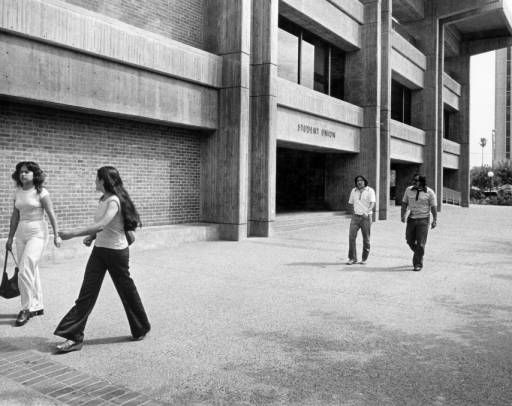
I was on the second story of the student union building standing looking over the edge into the large central atrium area, waiting for him to arrive for the lecture from the Art Department. When he came in he was surrounded by at least a dozen or more people, including the chairman of the department and many professors, including a number who had been my advisors. I was bummed about the crowd, figuring I would not get a chance right them to meet him. I saw them disappear under the walkway I was on to come up the stairs.
Robert Irwin
When they arrived at the top of the stairs they were all there except Mr. Irwin. I immediately asked the Chairman where he was and he said he had stayed downstairs to find a bathroom. That was all I needed to hear. I rushed down the stairs and found him walking down a hallway, indeed looking for a bathroom. I introduced myself, directed him to the bathroom and went in with him. We stood at side by side urinals taking a leak and talking. Luckily for me we both had to go really bad so it lasted a long time. I was able to to tell him of my admiration for his work, and the book, explaining about knowing Lawrence’s sister. I told him my status as a recent MFA grad, my working 3 jobs, including 2 part time teaching gigs at community colleges. He was incredibly gracious, especially considering we were peeing together.
Photograph: Graeme Robertson for the Guardian
When we were done we continued to talk and I asked him if he would autograph the book, which he did. He also gave me encouraging advice about how to deal with the first few years out of graduate school, how to work through hard things and keep creating worthy art at the same time. I then led him back up to the auditorium and to the front of the audience so he could give his lecture. I meanwhile skeedaddled to the restaurant to work my shift. I didn’t hear the lecture but I gained more than I had hoped!
When I was a young boy, around 13 years old, I would sneak a look at my father’s Playboy Magazines. I was no different than any other boy when it came to what excited me. Then again I was different. The famous 60s supermodel, Veruschka, showed me that with these photos from Playboy that I first saw when I was perhaps 16.
Veruschka – Playboy Magazine, 1971
Seeing a naked woman in art and photography was not that big a deal to me, having grown up around the nude in artworks of all types in my grandparent’s and parent’s homes. But this was not a naked woman, this was a woman transformed into something other than herself while at the same time expressing an even greater sense of who she was. It was a revelation.
Veruschka as a Peacock
Veruschka in Pink
In that and other pictorials she also became men, Marilyn Monroe, unzipped herself and transformed from animal to vegetable among other things. No other woman transfixed my imagination as a youth like she did. All the rest came and went, but Veruschka stayed in my mind as a woman apart. Not a model only, not a muse only, but an artist.
Verushka as a Man
Veruschka the Redneck
____________________
Veruschka started out as Vera Lehndorff but was unsuccessful as a model under that name and so reinvented herself as the mysterious Russian, Veruschka. She actually was born in Prussia (Poland) before WWII and was a very tall and gawky 6’1″ by the time she was 14 years old. She was teased and made fun of for her looks and skinny angularity. She stopped growing at 6’4″. She, along with Twiggy and Jean Shrimpton, were the first supermodels, dominating the covers and editorials of Vogue and every other fashion magazine of the 60s and early 70s.
Veruschka – Vogue Cover
Veruschka – Life Magazine Cover, 1967
________________
One of the most amazing things about Veruschka was that she did almost all the creative work on her fashion shoots. She did her own hair and makeup, as well as have creative control over the editorial scheme of the shoots in many cases. If you look close at her early fashion images you can see the roots of her later artwork.
Veruschka – Early body painting work
Notice the ‘Flower Power’ body painting work from the late 60s.
Veruschka in Brown
Veruschka in Green
Notice how she creates a visual image in which she completely blends in to her background. It’s a life long obsession to blend into the background that you will see reach its apex in her artwork.
Cheetah and Veruschka
Early on in her modeling career she worked to incorporate herself as animal into her shoots.
________________________
Fast forward to the 1980s and I find a book by Vera Lehndorff called ‘Veruschka | Trans-Figurations’. It documents a 16 year collaborative art project between herself and the photographer Holgar Trulsch. During those 16 years Veruschka painting herself to match various surroundings, from oxidized metal in abandon factories to boulders to weathered wood to the sky itself. Finding the book was like finding a dear friend after many years and seeing the amazing things she had done with her life. It’s one of my most treasured books because it is that perfect combination of visual beauty, conceptual brilliance, individual creative drive and surprise that I love.
Here are some examples from that book.
Veruschka in the Forest
Veruschka Among Boulders
Veruschka and Electrical Box
Veruschka and Tree
Veruschka and Steel Pillar
Veruschka and Linen Closet
Veruschka and Window
Veruschka and Sky
__________________
If you are thinking you’ve seen this sort of thing done many times before, you are right. Body painting has become a big thing over the past 2 decades in art and media culture around the world. You can see it among celebrities, in sports and in fine art. There are whole groups dedicated to it now with annual conferences and events. Take a look below to see some of the influence Veruschka has had.
Demi Moore
Sports Illustrated Body Paint book
Gotye video still – Somebody That I Used To Know – Emma Hack, artist
And finally here are some contemporary fine artists at work using the technique Veruschka developed.
Bookcase – Desiree Palmen
Bus Stop – Desiree Palmen
Qui Zhijie – tattoo 2
If you are interested in learning more about Veruschka or the evolution of the use of the body as a canvas start in google images and just type in Veruschka body painting and you will find plenty to investigate.
______________________
To see more ‘Artists I Love’ use the drop down menu at the top of the page.
I first got to know the work of Albrecht Durer, who was a Northern Renaissance artist, when I took an advanced seminar course on printmaking at the Boston Museum of Fine Art while I was attending Brandeis University. I found his work harder to understand than the other two artists we studied, Rembrandt and Goya, but that didn’t make me appreciate his genius any less. And a genius he was. Take a look at his self-portrait when he was a very young teenager.
He was raised to be a goldsmith like his father but was such a talent that he apprenticed the largest printmaking shop in the area instead. He traveled around Germany after that and eventually made his way to Italy where he drew some of the first pure landscapes in the history of Western Art.
Albrecht Durer – ‘The Great Piece of Turf’ – Watercolor, Pen & Ink – 1503
He was one of the first in Northern Europe to systematically investigate anatomy in detail, drawing hundreds of figures and diagrams to help himself understand the nature of the human body.
Albrecht Durer – Figure of a Woman Shown in Motion – 1528
Albrecht Durer – Studies on the Proportions of the Female Body – Woodcut – 1528
Adam and Eve – 1507
His greatest fame though came from his printmaking. By his mid-2os he was famous throughout Europe for his incredible engravings and woodcuts. The engravings are what I studied at the Museum. They are deeply symbolic and allegorical in many cases.
Albrecht Durer – Melancholia – engraving – 1507
Albrecht Durer – Four Horsemen of the Apocalypse – Woodcut – 1498
Albrecht Durer – Knight, Death and the Devil – Engraving – 1513
His detail and composition are always expert of course but it is his willingness to expose deep truths and fears of life that always grabs me the most.
Finally, if you ever look at artwork involving praying hands, such at the huge bronze sculpture of praying hands here in Tulsa, here you are seeing the foundational drawing that they all are rooted in. Probably his most famous work to the non art oriented public. Interesting enough, it is not titled ‘Praying Hands’.
Albrecht Durer – Hands of an Apostle – Drawing – 1508
Durer is well worth investigating, not just the images but his story as well.
______________________
To see more artists I love click the link at the top.
Hey Everyone, it’s wintertime again and that means I am going to restart my ‘Artist’s I Love’ Series. I will do an artist each weekend or so for a while. Let me know if you have a favorite artist, it might jog my memory and I’ll want to include them too!
If you want to see last year’s series, check it out under ‘Artist’s I Love‘.
Roger Brown Exhibition – 1981 – Catalog cover
First up for this year is Roger Brown. I first saw his work while I was a student in Graduate School at San Jose State University. I don’t remember the exact circumstances but I saw a show of his work and it blew me away. He combines humor, social commentary, great painting (and other media) techniques, fantastic color and spot on compositions. He is inventive, creative, always moving forward in exploring the possibilities of art.
I got this catalog from a Roger Brown exhibition that I did NOT attend. I was at a museum that had a few pieces of his and saw this catalog in the museum bookstore and had to have it. It’s been opened a LOT since I got it 30+ years ago, as you can tell by what shape it is in. He’s been one of my favorite artists ever since.
The Entry of Christ into Chicago in 1976 – Roger Brown
This image might be his most famous piece and it’s indicative of his imagery, high contrast and stylized into flattened patterns with repetitive elements. The subject matter is both contemporary and historical, which is also typical of many of his images. But there is a decided anti-religious feel to the piece, as if it is a tacky city-sponsored event.
‘Talk Show’ – Roger Brown
He frequently uses suburban scenes, most often with the banality of that world appearing to be the message. At the same time he uses it so much that I have always go the feeling that he knows and actually has affection for that world, even while leveling a sort of frustrated critique on it.
‘Devil’s Surprise’ – Roger Brown
‘Jim and Tammy Show’ – Roger Brown
As is obvious, he has no love lost for organized religion in this painting. The surprise that the churchgoers are the ones in hell probably has a lot to do with his being from the south and having been raised with that baptist fundamentalism all around him. His tacky, paperdoll cut out view of Jim and Tammy Bakker, preachers who fell from grace in the 90s, also give that message.
‘Post Modern Res Erection’ – Roger Brown
He has also played around (pun intended) with making light of America’s sexual obsessions, which isn’t unrelated to our religious ones.
‘Family Tree Mourning’ – Roger Brown
His social commentary wasn’t restricted to just two of the taboo dinner subjects, religion and sex, he dealt with the third as well, politics. Here he connects all our wars up until that time into a gigantic national family tree. He obviously felt that war had come out of and had overwhelmed the goodness of our founding.
He did a number of fine art prints and in this case made sure the viewer knew it was a print by saying so right on it. I like that cheekiness.
‘Twin Towers’ – Roger Brown – 1977
Brown delved into 3D work in his later career while not actually straying very far from his thematic and visual focus. This is obviously done much closer to the construction of the World Trade Center than it’s destruction, but it has a very moving feel to it, with the emphasis on the silhouettes in each window busy doing their work.
Here are just a few more I think are of interest.
‘Crater’ – Roger Brown
“City Expanding’ – Roger Brown
_________________
If you like his work you can read more about him at:





 Albrecht Durer – Four Horsemen of the Apocalypse – Woodcut – 1498